

How to Style a Bookshelf Like an Interior Designer
How to Style a Bookshelf Like an Interior Designer
A well-styled bookshelf does not happen by accident — but once you know the rules, it is surprisingly simple to pull off.
A bookshelf that looks like a designer styled it follows a set of rules that most people have never been taught. It is not about buying expensive objects or having perfect taste. It is about height variation, negative space, a consistent color palette, and knowing how to use books as a design tool. Once you understand these principles, you can apply them to any bookshelf — built-in, freestanding, or floating — in any room of your home.
- Start by clearing everything off
- Choose a color palette before you put anything back
- Use books as your foundation
- Vary heights to create visual rhythm
- Group objects in odd numbers
- Mix textures and materials intentionally
- Add plants for life and movement
- Lean art instead of hanging it
- Leave negative space on purpose
- Step back, edit, and repeat
💡 Before you start: Gather everything you own that could go on a shelf — books, plants, candles, frames, ceramics, baskets, and small objects. Lay it all out on a flat surface so you can see what you are working with before a single thing goes back on the shelf.
The step-by-step process
Clear everything off and start with a clean slate
The single most important step is one most people skip. Remove every object from the shelves completely. A fresh start lets you see the actual proportions of each shelf, notice how much space you are working with, and make decisions without being influenced by where things already are. Clean the shelves while they are empty. Then do not put anything back until you have done step two.
Pick a color palette and stick to it
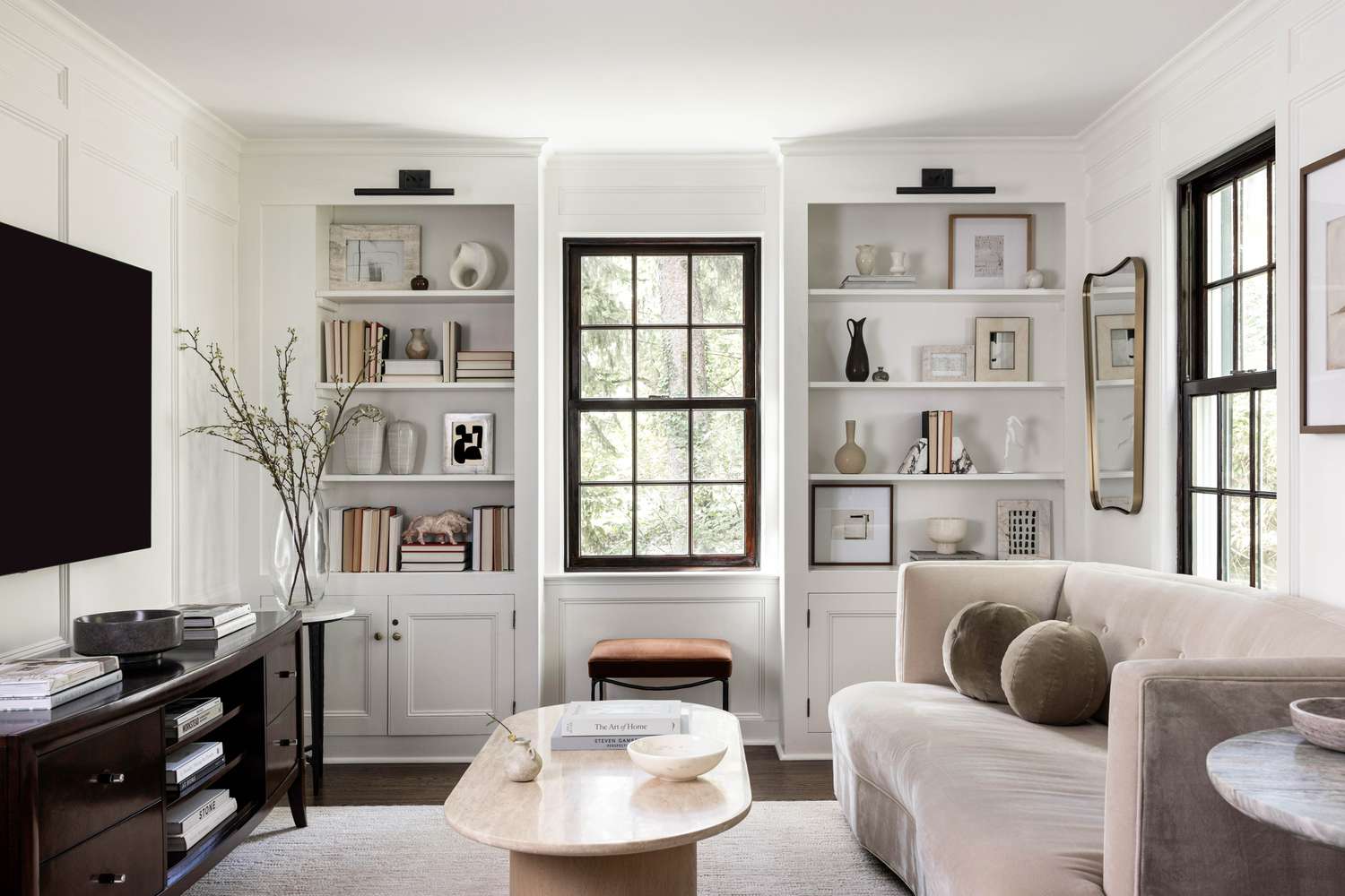
This is the move that separates a styled shelf from a cluttered one. Before anything goes back on the shelf, choose 2–4 colors to work with. Neutral palettes — white, cream, warm beige, natural wood, black — create a calm, cohesive look that suits almost any room. If you want more personality, choose one or two accent colors and repeat them across every shelf so the eye flows naturally from top to bottom.
Books that do not fit the palette can face backward so the pages show instead of the spines. It is a polarizing trick among designers, but it works well for a neutral, organic look.
Use books as the structural foundation
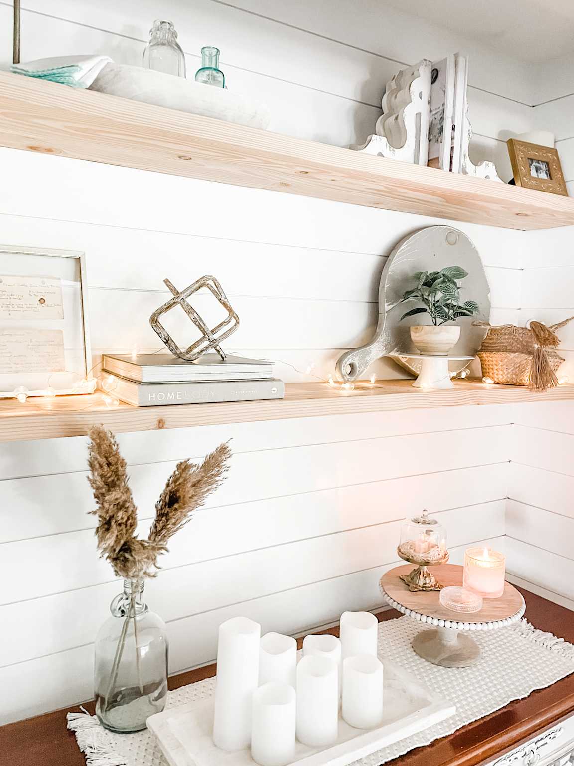
Books are your most powerful styling tool and the one most people underuse. Place them first before any decorative objects. Stand some upright in groups, lay others flat in short stacks of two or three to create risers for objects placed on top. Stacked books act as pedestals that give smaller objects visual weight and elevation they would otherwise lack. Mix thick coffee table books with thinner paperbacks for natural height variation within each group.
Vary heights across every shelf
A shelf where everything is the same height looks flat and static. A shelf with intentional height variation — a tall vase next to a stack of books next to a small ceramic object — keeps the eye moving and feels curated. The general rule is to place your largest, heaviest items on the bottom shelves to anchor the arrangement, then work up to lighter and more delicate pieces near the top. Within each shelf, alternate tall items with shorter ones rather than lining them up by size.
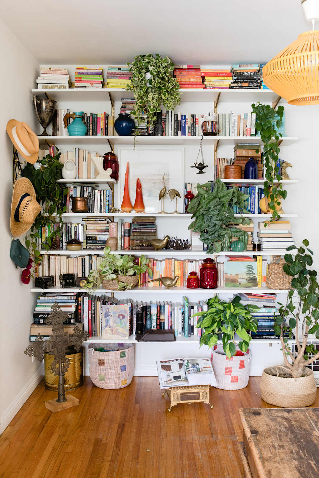
Eclectic styling with books as the foundation and plants for movement.
Floating shelves styled with a warm neutral palette — a clean, approachable look for beginners.
Group decorative objects in odd numbers
Designers consistently use odd numbers — especially groups of three — because the eye finds them more interesting than even pairs. Instead of placing one candle and one vase side by side, try a candle, a small ceramic bowl, and a book stack. Instead of two identical frames, use three in varying sizes. Odd groupings look more collected and organic, which is exactly what makes a shelf look like it was styled over time rather than arranged all at once.
Mix textures and materials intentionally
Visual interest on a shelf comes from contrast. Pair a shiny ceramic vase with a matte linen-covered book. Place a rough woven basket next to a smooth glass object. Mix a warm wood piece with something metallic. When every object is the same material or finish, the shelf looks uniform in a way that feels flat, regardless of how attractive each individual piece is. A thoughtful mix of matte and shiny, hard and soft, organic and geometric is what gives a shelf depth.
Add at least one plant per section
Plants bring life, movement, and organic color to a shelf in a way that no decorative object can replicate. A small trailing pothos or string of pearls hanging over the edge of a shelf adds softness and a sense of lived-in warmth. A compact succulent or a single stem in a bud vase works for shelves with less depth. Even one plant per grouping makes the whole arrangement feel less static and more like a real living space.
Lean art against the back of the shelf
Leaning a small framed print or piece of art against the back wall of a shelf — rather than hanging it — is one of the most common tricks interior designers use because it creates a layered, casual look that feels collected rather than staged. It also allows you to easily swap pieces in and out without leaving holes in the wall. Layer a smaller frame in front of a slightly larger one, or lean a piece of art behind a book stack for depth.
Leave negative space on purpose
The instinct when styling a bookshelf is to fill every inch. Designers do the opposite. Leaving approximately 30% of each shelf empty gives the objects that are there room to breathe and be noticed. An empty stretch of shelf next to a carefully arranged grouping makes that grouping look more intentional. Negative space is not a sign that the shelf is unfinished — it is part of what makes it look designed.
Step back, look from a distance, and edit
This is the step that separates a styled shelf from a finished one. Stand back at least 10 feet, or take a photo on your phone and look at it. Photos are especially useful because they reveal imbalances and crowding that are easy to miss up close. If one area looks heavy, remove something. If a shelf looks empty, add a stack of books or a trailing plant. Keep editing until every shelf feels balanced from a distance, not just close up.
5 designer formulas that always work
These are the combinations interior designers rely on when they need a shelf to look good fast. Each formula works on a single shelf or can be repeated across multiple shelves for a cohesive overall look.
① The Classic Riser
Stack of 2–3 books flat → object on top (ceramic, small plant, candle) → books standing vertically beside it. Simple, clean, and the most beginner-friendly formula on this list.
② The Leaned Art Stack
Leaned framed art at the back → stack of horizontal books in front → single small object at the base. Adds depth and an instant designer quality.
③ The Plant Anchor
Trailing or cascading plant on one end → books filling the center → single tall vase or candle on the other end. The plant softens the whole arrangement naturally.
④ The Texture Mix
Woven basket or bowl → stack of books with a matte ceramic on top → metallic or glass piece. Three materials, one shelf, completely cohesive.
⑤ The Negative Space Feature
One tight grouping of 3–4 objects on one side of the shelf → leave the rest completely empty. Bold, minimal, and always looks intentional.
⑥ The Color Block
Group books by spine color into blocks of warm, neutral, or dark tones → add one accent object in a contrasting color at each end. Works especially well on large built-ins.
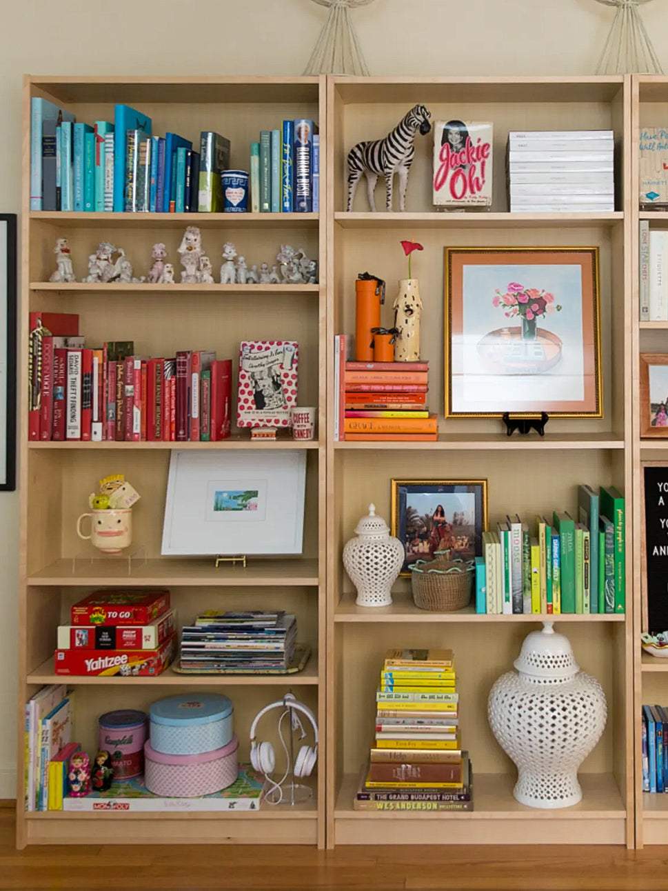
Books used as the structural layer, with objects, plants, and framed art layered in front — the approach designers use on almost every built-in.
What to put on a bookshelf
| Category | Examples | Styling tip |
|---|---|---|
| Books | Novels, coffee table books, cookbooks | Stack horizontally as risers; group vertically by color or height |
| Plants | Trailing pothos, succulents, air plants | Use at least one per shelf; place trailing plants at the edge |
| Ceramics & vases | Bud vases, sculptural bowls, planters | Mix matte and glossy finishes; vary sizes within each group |
| Framed art | Small prints, photos, sketches | Lean at the back of the shelf rather than hanging |
| Baskets & boxes | Woven baskets, lidded boxes, trays | Use on lower shelves for visual weight and hidden storage |
| Candles | Pillar candles, taper candles, votives | Group in odd numbers; vary height |
| Personal objects | Travel finds, heirlooms, collected pieces | Use sparingly — these are the pieces that make it feel like yours |
Do’s and don’ts
✓ DO
- Start with a cleared shelf every time
- Use a consistent color palette across all shelves
- Mix vertical and horizontal books
- Group objects in threes
- Leave 30% of each shelf empty
- Layer materials: matte with shiny, organic with structured
- Add at least one plant for life
- Step back and edit from a distance
- Repeat one or two elements across multiple shelves for cohesion
✗ DON’T
- Fill every inch of every shelf
- Mix too many colors without a unifying thread
- Use all objects the same size or height
- Ignore the shelves above eye level — they matter
- Put your most meaningful pieces at the very bottom where no one sees them
- Use too many small objects with no clear grouping
- Forget to clean and rearrange shelves every few months
Budget-friendly shopping list
| Item | Where to find it | Approximate cost |
|---|---|---|
| Small trailing plant (pothos) | Trader Joe’s, Home Depot, local nursery | $5–$12 |
| Bud vase or small ceramic | Target, TJ Maxx, HomeGoods | $8–$18 |
| Small framed print | Amazon, IKEA, Etsy | $10–$25 |
| Woven basket (small) | Target, World Market, TJ Maxx | $10–$20 |
| Pillar or taper candle | IKEA, Target, HomeGoods | $4–$12 |
| Coffee table book | Amazon, used bookstores, thrift stores | $5–$30 |
💡 Best thrift store find: Hardcover books with neutral or linen spines are everywhere at Goodwill and thrift stores for $0.50–$2 each. A stack of five or six matching-tone hardcovers placed on a shelf looks far more expensive than it is — and nobody needs to know.
The bottom line
A designer-styled bookshelf follows a process, not a talent. Clear the shelf, choose a palette, use books as the base, vary heights, group in threes, mix materials, add a plant, leave breathing room, and edit until the whole thing feels balanced from across the room.
That process works on a $30 IKEA shelf and a $3,000 built-in. The principles are the same. The budget just changes what the individual objects look like.
Frequently Asked Questions
SEO title: How to Style a Bookshelf Like an Interior Designer – No Experience Needed (2026)
Meta description: Learn how to style a bookshelf like an interior designer with these step-by-step tips. Covers books, objects, color, height, and negative space — no design experience required.
URL handle: how-to-style-a-bookshelf-like-an-interior-designer